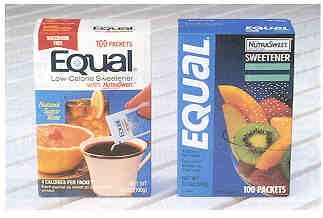
This appeal of balancing good taste with good nutrition was accomplished through new packaging created for Equal by S&O Consultants, Inc., a San Francisco-based permanent media specialist.
"We wanted to broaden Equal's appeal beyond that of a diet product used primarily in coffee and tea," says Margaret H. Widelock, senior vice president of S&O. "The packages' appetizing vignettes help convey this message."
The product's five new packages highlight Equal's use-on-food properties; appetizing vignettes show Equal sprinkled on cereal, coffee, iced tea, fruit salad and fresh strawberries. The five versions appear simultaneously on the grocery shelf.
When Equal was originally introduced, it was promoted as a better tasting, saccharin-free alternative to other brands in the sugar substitute category, especially market leader Sweet 'N Low. To lure a broader audience, it is targeting many previous non?users who were dissatisfied with the taste of sugar substitutes but wanted a sweetener.
Research in 1986 by NOVA Research, Inc., San Francisco, S&O's sister company, also indicated a need to strengthen brand identity, distinguish Equal from its look-alike competitors, heighten appetite appeal and provide a greater level of NutraSweet recognition. The quantitative label evaluation study by NOVA measured the effectiveness of the previous label design and four new alternatives in projecting key product attributes and the desired imagery.
Research sample
The sample in the study was comprised of 1,121 female heads-of-household between 21 and 59, who sweeten food and beverages on a regular basis. One-third of the respondents use sugar most often, one-third use Equal most frequently and one-third use saccharin.
Research methodology
Respondents participated in a standard tachistoscope (T-scope) shelf visibility test to measure speed of registration of the product category, brand identity and key packaging elements for the Equal designs and competitive products within the array. The same participants also completed a label communication T-scope test.
According to Mary Fox, account supervisor at NOVA, the T-scope shelf visibility test uses an electronically-timed shutter to control how long the respondents view a particular stimuli. In this case, respondents saw slides of grocery shelves stocked with variously arranged packages of Equal, competitive sugar substitute products and regular sugar.
"It's a way of finding out how visible your package is," says Fox.
The label communication T-scope test involved showing respondents a slide with only one sugar substitute product on it. Fox says its purpose is to find out what the respondents could read on the package and what's important enough about it to stick in their minds.
"The test tells us, can they read what the manufacturer wants them to read?" explains Fox. "Also, what color do they see? What words do they pick out and is the type size large enough?"
Their responses helped determine what features should be included on the new package.
Respondents took a series of other tests, evaluating the projected image, overall appeal, purchase inclination and basic product and brand usage.
A sub-sample of the total participated in eye-movement tracking research, in which they were exposed to a series of slides simulating a store walk-through. Included in this sequence was a mass display slide and a close-up beauty shot of each Equal test package.
Study results
The packaging design that was ultimately selected scored fastest in speed of recognition and attained a high level of both brand recognition and shelf visibility. It appropriately communicated brand, product and packaging imagery and beat out the other alternatives in its level of "NutraSweet" recognition.
The package's attractive design incorporating bright, bold colors and eye-catching vignettes also won greater consumer appeal than the other designs.
All of the design alternatives outperformed Sweet 'N Low and three out of four out performed the previous label in communicating attributes such as "clean," "uncluttered," "contemporary" and "very attractive."
 |
The design also evoked overwhelming appetite appeal. The positive appeal of this design became even more apparent in the eye-movement tracking test. Respondents spent more time viewing slides which had this package on the shelf, with many noticing the product in particular.
With respect to purchase inclination, the proposed test packages generated favorable interest on a par with the current package.
According to Widelock, "The packaging capitalizes on the well-known NutraSweet brand sweetener in Equal and on the brand name and clearly distinguishes the product from its competitors."
To reflect that objective, the brand name "Equal" is reversed out in white and is vertically displayed in bolder and larger type down the front left panel. A royal blue replaces the predominant fluorescent blue of the original package and becomes proprietary for the product.
There was some concern with the vertical positioning of the brand name on the selected design. However, research did not indicate any consumer difficulty with this format because the name is short and simple.
The NutraSweet designation appears in a box at the top right. The reference is underscored by two turquoise bars forming an equal sign. White sprinkles of Equal emerge onto the nutritious food depicted below.
The five packages side by side produce a billboard effect on the grocery shelf; clear product identification attained through the use of blue, the appealing food vignettes and the brand name.
"The new packaging for Equal has helped us reposition the product as a healthier, natural replacement for sugar," explains Fred Dial, marketing manager for the NutraSweet Co. "Not only is it more appetizing but it emphasizes the direct use-on-food characteristic and takes advantage of the NutraSweet endorsement. Equal is no longer just a low-calorie sugar substitute for use in tea and coffee."
