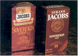
The rich package design for the Delavan, Wis. -based brand's line of four coffees was created because the original packaging for Jacobs failed to create a strong presence in the category. Compared to its com- petition, the brand had fewer facings and was contained in a smaller brick pack. Moreover, the packaging did not distinctly designate each product - regular and decaffeinated coffee and regular and decaffeinated espresso.
"We wanted to ensure that the new packaging reinforced Jacobs as a premium brand coffee with a strong European heritage," explains C. Gerron Vartan, senior vice president of S&O Consultants, Inc., a marketing and design specialist in permanent media. "A more dominant use of the brand name and a color-coding system makes the coffees stand out on the shelf while clearly differentiating between flavors."
Packaging research
The research for Jacobs' packaging was conducted last year by NOVA Research, Inc., San Francisco. NOVA conducted a quantitative design arbitration study. The research evaluated the current and three proposed label alternatives. The main objectives of the study were to:
- Measure the visual impact and recognition characteristics of the design concepts in relationship to each other and key competition
- Evaluate the visibility and readership properties of the four alter- natives and,
- Assess the imagery conveyed by each of the four alternatives.
Study and approach
Four-hundred individuals - primary grocery shoppers between 21 and 50 who had purchased coffee in the past month - participated in visibility and projected imagery tests. One-half of the sample had purchased super-premium coffee in the past month.
Respondents participated in a standard tachistoscope (T-scope) shelf visibility test in which they were exposed to a cluttered, mass display including one of the Jacobs designs. The consumers also took a label communications T-scope test which exposed a close-up beauty shot of the test package and its key competitor, Maxwell House's Masters Collection, shown at progressively longer exposure intervals.
A T-scope test is a way of rneasuring how long the, respondent views a particular stimuli, says Mary Fox, account supervisor at NOVA. A label communication T-Scope test is a way of finding out what respondents can read on the package and what features about it are important enough to stick in the respondents' minds.
Other tests evaluated purchase interest, likes and dislikes, quality, flavor and preference. A sub-sample of the total participated in eye-movement tracking research in which they were exposed to a series of slides simulating a store walk-through.
Research results
In terms of projected imagery, the "contemporary" design which is currently in the marketplace, out- performed the previous label and competitors on key attributes related to desired positioning objectives. It also generated strong consumer appeal, communicated a coffee which is better than other brands, is processed for everyday use and has a label that is both attractive and eye-catching.
 |
The new design retains the color equities of the original packages by using dark, rich colors - green, blue, burgundy and brown - to reinforce the full-bodied taste of the coffees.
The package emphasizes the brand name "Jacobs" in bolder type, along with a much more dominant "Johann" to strengthen the ties to the European tradition of the coffee. The design's use of Johann in this way had more impact than the other alternatives.
The research found that while the purchase interest for all the Jacobs label alternatives, as well as for key competitors, was relatively low due to the basically unbranded nature of the category, the premium coffee user was more likely to purchase the three proposed designs than either the current one or the competitor's products.
Both the "contemporary" and "close-up" designs communicated brand, product and packaging imagery consistent with Johann Jacobs' premium positioning and European heritage, but the "contemporary" was particularly liked due to its color, design elements and classy, elegant appearance. The "close-up'" on the other hand, better communicated the European traditions of the coffee.
Contemporary design
The contemporary design features a gold foil medallion which highlights attributes of the brand, such as "imported" and "Europe's most preferred coffees," along with the brand name. The names of the blends appear in serif type underneath the medallion.
As part of the nomenclature system which describes the products, the decaffeinated blends emphasize their use of the special Swiss water- process created by Jacobs.
Bright bands serve as important design elements to color-code the four flavors while enhancing the dominant color of each package. The overall effect is a less cluttered, more elegant package.
"The richer, more upscale packaging supports our premium positioning in the marketplace;' says Robert A. Crockett, marketing manager, the Jacobs Coffee Co. "Through the bolder use of our brand name and a color-coding system, Jacobs has created a strong section look in the category while clearly segmenting its four flavors."
