This way to fun
Prominent signage is key when navigating a new space. This is especially true when the majority of a location’s visitors are parents or guardians who are attempting to guide themselves while caring for young children. In partnership with the University of Southern Indiana (USI), the Children’s Museum of Indianapolis used eye-tracking to determine how effective their wayfinding signage truly was for first-time guests.
The Children’s Museum of Indianapolis, the largest children's museum in the world, sees over 1 million visitors annually. It aims to inspire and empower children worldwide by cultivating learning, celebrating people and encouraging innovation. To achieve innovation themselves, the museum’s marketing and external relations and research and evaluation staff decided to work with the Biometrix Discovery Lab at USI to gather wayfinding insights to understand the effectiveness of their wayfinding signage and how future adjustments can improve it, examining why participants are drawn to specific wayfinding signage, what captures their attention and for how long, what subtle behaviors they are exhibiting and what ultimately affects their decision-making.
The museum recruited a total of 15 research participants using advance and day-of recruitment. The museum staff invited friends and family who had not yet visited and also asked people as they walked in. Along with the opportunity to use the eye-tracking technology, many of those recruited were interested in giving back to the museum and were surprised it cared enough to conduct studies of that nature.
To qualify for the study, the participants had to be at least 18 years of age as they had to consent to have their eyesight and audio monitored and recorded. To accurately reflect the kinds of visitors it sees most, the museum required participants to have at least one child under the age of 13 with them. Having children was also important because most parents and guardians are often distracted by them, helping them walk through crowded areas and listening to their thoughts about the space, resulting in them only paying partial attention to the signage as they navigate. Their attention is often divided between what they are doing, where they are going, where all their belongings are and where their child is.
Being a first-time visitor was a crucial requirement for participants as returning customers would likely not use or need the wayfinding signage.
In exchange for their participation, the museum offered those who had not purchased their ticket in advance free entrance. It also gave them a $20 gift card to its store since most first-time visitors purchase a snack or souvenir.
Visual and audio data
For this project, eye-tracking glasses were deemed the most appropriate biometric tool to collect data in real time. The eye-tracking glasses let researchers capture visual data from participants, allowing them to see the behaviors participants might not have remembered, noticed or were not able to articulate. They also offered audio data, which allowed researchers to gather additional information from the comments participants made to their children or party regarding their navigation plans after either seeing or not finding directional signage. “We don't know exactly what your mind thinks but we know what information your mind was receiving as you were making decisions,” says Chad Milewicz, chair of the economics and marketing department at the University of Southern Indiana and coordinator of the Biometrix Discovery Lab.
Biometric tools let researchers capture behaviors that participants were unaware of. They can offer insights that may have gone unnoticed including how much longer one sign captured their attention than another, if they noticed specific signs or images or what locations they found the most confusing as they navigated the new space.
Audio was an additional method of data collection in the Children’s Museum of Indianapolis research project. It allowed researchers to listen and analyze information from participants who voiced their thoughts to themselves or their party throughout the project. Comments were made about finding signage and to young children about trying to find the way to a certain area. Audio and visual data was gathered in real time, offering researchers the opportunity to see exactly how first-time visitors experienced the space.
Wayfinding within the museum
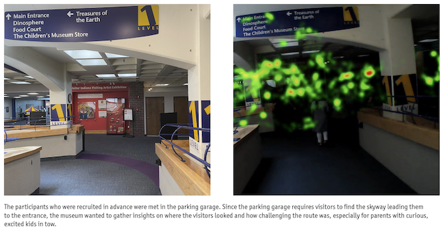
Navigating the museum entrance. The participants who were recruited in advance were met in the parking garage. Since the parking garage requires visitors to find the skyway leading them to the entrance, the museum wanted to gather insights on where the visitors looked and how challenging the route was.
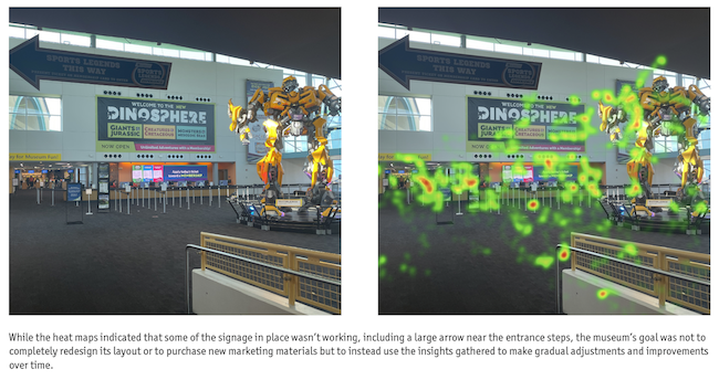
 When visitors first enter the museum, their first mission is often to find the ticket counter but how easy does wayfinding signage make that task? After entering the museum, visitors are faced with crowds and are consumed by eye-catching sights, often leaving them unable to find the signage they need. While researchers thought the museum had clear messaging in its busiest areas, the heat maps indicated that some of the signage in place wasn’t working, including a large arrow near the entrance steps. “How do you account for the activity of the space and design if you are designing it without the activity there?” says Milewicz, emphasizing that what makes the most sense when laying out signage in an empty building may prove to be ineffective once the museum is full of visitors.
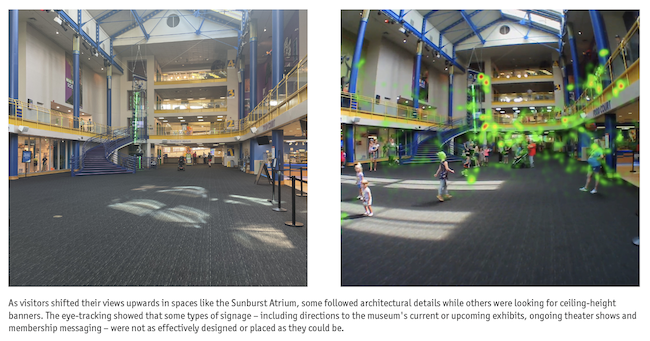
The wayfinding missions. The wayfinding project continued by asking participants to scan their tickets at the entry gates, enter the Sunburst Atrium and find the outdoor sports area, the Riley Children’s Health Sports Legends Experience, from the third level of the museum.
 While completing these tasks, visitors shifted their views upwards as some followed architectural details while others were looking for ceiling-height banners. The eye-tracking showed that some types of signage – including directions to the museum's current or upcoming exhibits, ongoing theater shows and membership messaging – were not as effectively designed or placed as they could be.
A task that was noticeably more difficult than the others was wayfinding from the third level of the museum to the Riley Children’s Health Sports Legends Experience. Whether it was due to the museum’s layout, a lack of signage at key intersections or simply a lost sense of direction, navigating the route proved to be a challenge for many.
A key component when conducting research is to avoid any interference. In this project, researchers did not want to influence participants’ decisions when completing navigational tasks. Susan Foutz, director of research and evaluation at the Children's Museum of Indianapolis, says a crucial part when answering any navigational questions was to encourage them without directing them. “We really did follow behind them a discreet distance…there were people who would turn around and say, ‘Now what do I do?,’” says Foutz. Implementing the advice they had received from Milewicz and his team, they would respond with questions, including “Well, what do you think?,” “There’s two ways to go, which way would you go?” and “Why don’t you walk that way and see.”
Instead of offering every participant a map to navigate from, the museum only gave them to those who asked. “We did get some really cool views of people using the map but who were still not quite able to figure out where they wanted to go,” says Foutz. This gave researchers additional insights as to how effective museum maps were when trying to find specific areas of the museum.

Triangulate their answers
In addition to wearing eye-tracking glasses, research participants also completed a short interview to help researchers triangulate their answers with the data they collected. To better grasp their thoughts, participants were asked if they recalled any specific messaging about the events at the museum or museum memberships. While researchers could see the visual data from the eye-tracking glasses and heat maps, they still wanted visitors’ input on what caught their attention the most, what they remembered and if they had any specific difficulties navigating the space.
Researchers also asked about participants’ experience navigating from the interior of the building to the Riley Children’s Health Sports Legends Experience. They were asked what tools they used to find it, how challenging they found it and if they had any suggestions to improve navigation including implementing a color-coding system or adding a staff member to the area to answer questions.
While the participating adults were asked the questions, children weren't afraid to voice their input. Foutz says that at times children would pay more attention to the signage and its location (“It was right there on that monitor, we walked right under it, mom.”) or would be more than happy to brag about knowing where to go next, contradicting what their parent or guardian ultimately did. “I should have just listened to him,” says the father of an eight-year-old who suggested going the correct way.
Another important finding highlighted by both Foutz and Milewicz was that when a stimulus was used on one side of the museum, the participants would often continue to look in that direction, even after they had passed the attraction. “One of the things I’ll keep going back to is this idea that if visitors’ attention is drawn and they look one direction, they're going to keep looking in that direction for a long time…even if that thing that drew their attention has already passed, they're still looking that way,” says Foutz.
“People never went 180 degrees to the other side of their vision,” says Milewicz. “Their attention was attracted towards exactly what you wanted them to look at but then, after they turned from that major item, their vision never went 180, it always went, at best, 90 degrees.”
This insight helps researchers understand why some signage received little to no attention. If signage is placed immediately after a large attraction in the opposite direction of it, it can be predicted that few people will notice it.
Gradual adjustments
The museum’s goal was not to completely redesign its layout or to purchase new marketing materials but instead to use the insights gathered to make adjustments to the signage. “We do want to use the data to inform our decisions going forward,” says Foutz. “We’re not going to tear down every sign and start over, we're going to replace things gradually.”
The museum staff implemented the insights when replacing seasonal materials, like multi-story banners, this past winter. They chose to feature signage that consisted of more visuals and fewer words.
Great first impressions
When visiting a new educational place like a museum, zoo or other attraction, exploring and having fun are the top priorities. The last thing any facility wants is for its visitors to have a rocky start to their adventure by feeling lost, frustrated or confused by how to navigate the entrance and its exhibits. As the staff of the Children’s Museum of Indianapolis found, conducting research is an effective way to help ensure guests of all ages continue to have great and lasting first impressions.
