Editor’s note: Adam Di Paula is project director at CGT Research International, Vancouver, B.C.
One of the most difficult challenges facing market researchers is to explain the practical importance of statistical results. Undoubtedly, many researchers can recall instances when their presentations of statistical results were met with blank stares, glazed eyes and uncomfortable silence. The difficulty is not limited to explaining results based on complex statistical procedures. The correlation coefficient (r) is a case in point. In this article I will discuss how using a technique called the binomial effect size display can aid in communicating the importance of correlational results.
A correlation coefficient is a number that tells us how strong the relationship between two variables is. The number can range from -1 to 1, with higher numbers (in either the positive or negative direction) indicating a stronger association between variables. Correlations are used for a variety of purposes, e.g., to determine drivers of overall satisfaction or to predict purchase behavior.
Calculating the coefficient is easy (usually a matter of point-and-click). Problems arise when we want to explain the meaning of the results. Two oft-used methods of explanation often fall short of providing clients with a clear understanding of what the results mean (and why the client should care).
One way that researchers attempt to explain the importance of correlational results is by computing the “percent of variance accounted for,” which is done by squaring the correlation coefficient. Thus, if the correlation between two variables, say education and income, is .5, we can conclude that 25 percent of the variance in income can be accounted for by variation in education. Huh? Not surprisingly, this explanation tends to confuse rather than inform. It is no wonder that researchers continue to argue about the meaningfulness of this calculation.
Somewhat more useful is what I call the “soft drink description.” This is the process of arbitrarily dividing correlations into the categories of small, medium and large. For many researchers, correlations below .3 are considered small (and not worth worrying about), correlations of .3 to .5 are considered medium (and of some interest), and correlations of .5 to .8 are considered large (and should be focused on). Note that correlations over .8 (extra-large or “super-size” correlations) are rarely obtained and, if they are, tell you that your two variables are basically measuring the same thing. This way of explaining the practical importance of correlations is easily grasped and does provide some direction for clients. However, the crudeness of this method often falls short of communicating the importance of the result.
A third technique developed by social scientists in the 1980s - the binomial effect size display (BESD) - can help bring to life the importance of your results. Suppose that your aim was to predict repeat purchase behavior among a group of customers - half of whom who have made a repeat purchase, half of whom have not - using a customer attitudes index. In correlating the index with purchasing behavior you obtain a correlation of .50. As discussed, we might say “25 percent of the variance in repeat purchase behavior is explained by variation in scores on the index.” Aside from being confused, your client might also think that this result is not very important (“Only 25 percent?!”). He or she would be wrong, and the BESD can show why.
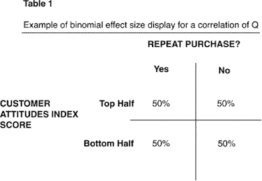
We begin by constructing a 2 X 2 matrix as shown in Table 1, with two levels for the customer attitudes index (scorers in the top half and scorers in the bottom half) and two levels for purchase behavior (repeat purchase/no repeat purchase). Computing the cell entries begins with the assumption that there is no correlation between the measures. If this were the case, we would expect that 50 percent of the customers who scored in the top half of the index made repeat purchases and 50 percent who scored in the bottom half of the index made repeat purchases. This would give us 50 percent in each cell, since all rows and columns must add to 100 percent.
 |
To represent the correlation in the matrix, remove the decimal point from the correlation, divide this number by two and add the result (25) to the top left cell. Now adjust all cells so that all rows and columns add to 100 (see Table 2).
The BESD tells us that 75 percent of those who score in the top half on the customer attitudes index made a repeat purchase while only 25 percent of those scoring in the bottom half did so. The meaning of this result is easily grasped and the implications are fairly clear. Moving from bottom to top on the customer attitudes index increases the probability of a repeat purchase by three times - an important result. Indeed, this index will be very useful to the client in understanding the determinants of repeat purchase behavior - much more useful than “25 percent of the variance” makes it sound.
 |
The BESD is a flexible technique because it can be used with any kind of data that can be meaningfully dichotomized. So, the next time you want communicate the importance of your correlational results in a way that is meaningful to your client (and in a way that will keep him or her awake during your presentation) remember to do your BESD.
